
Flourish
TYPEFACE DESIGN
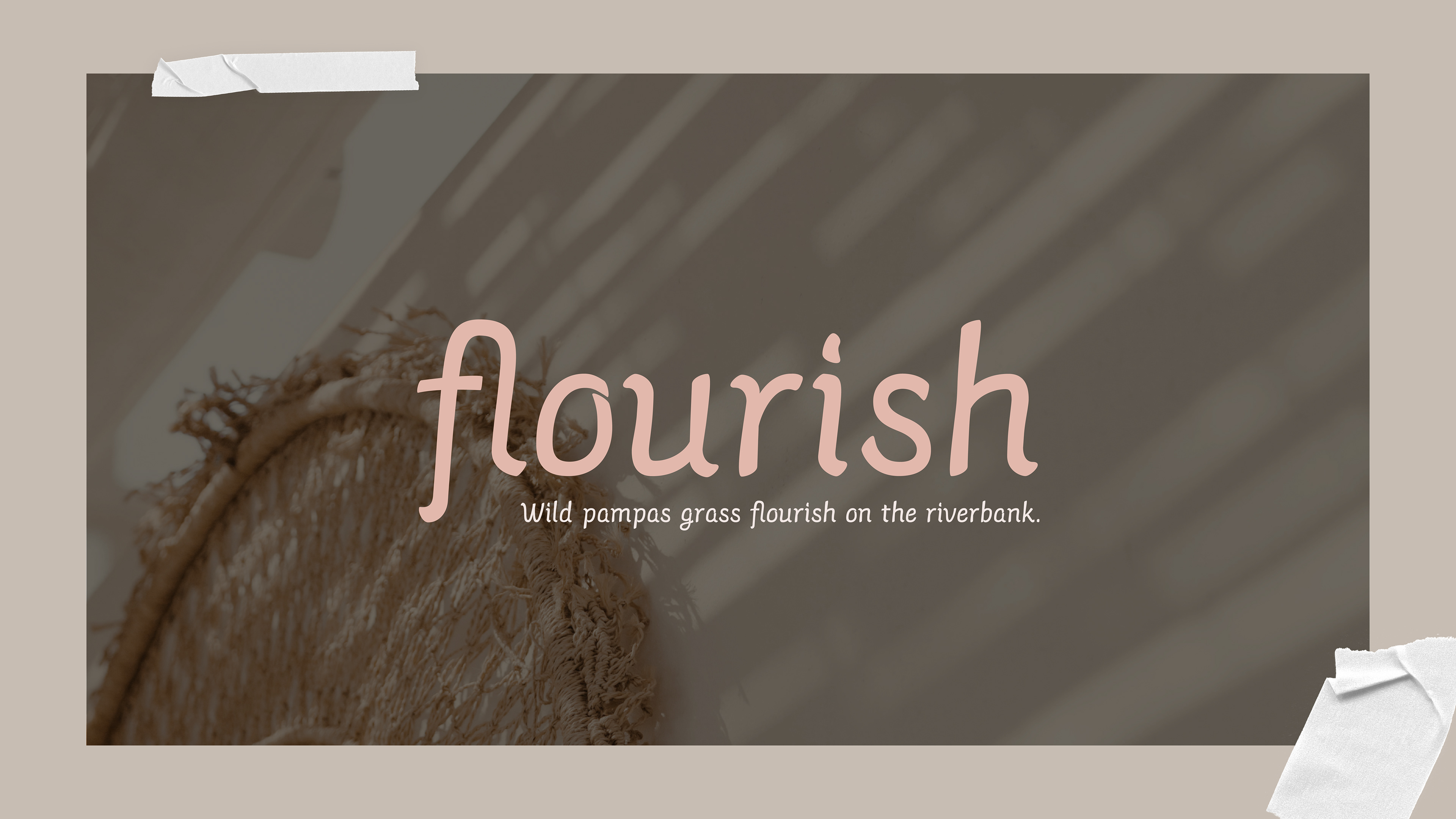
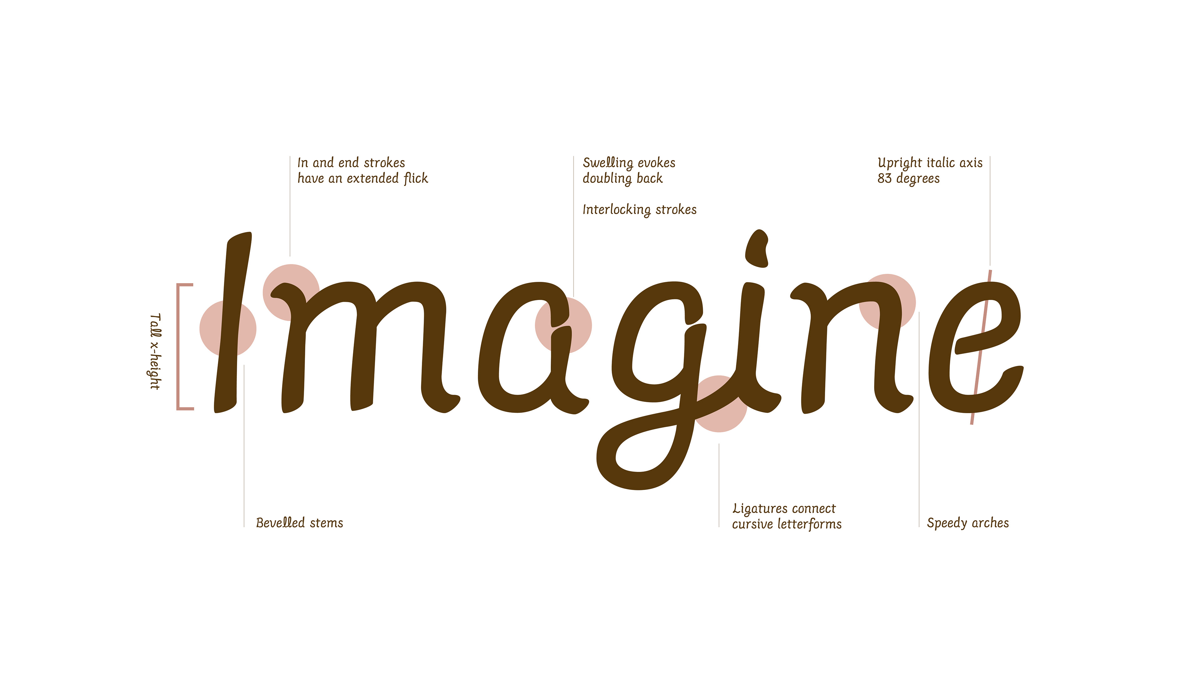
This typeface Flourish is an upright italic that incorporates handwritten elements. The inspiration is derived from my mother's handwriting that combines a feminine cursive and a traditional sans serif.
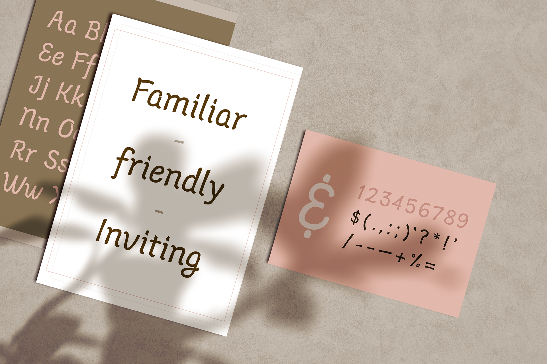
Flourish has a feeling of home and familiarity which can be beautifully paired with packaging and branding. Its speedy yet stable curves allow for it to be legible at small and large sizes.
Characteristics
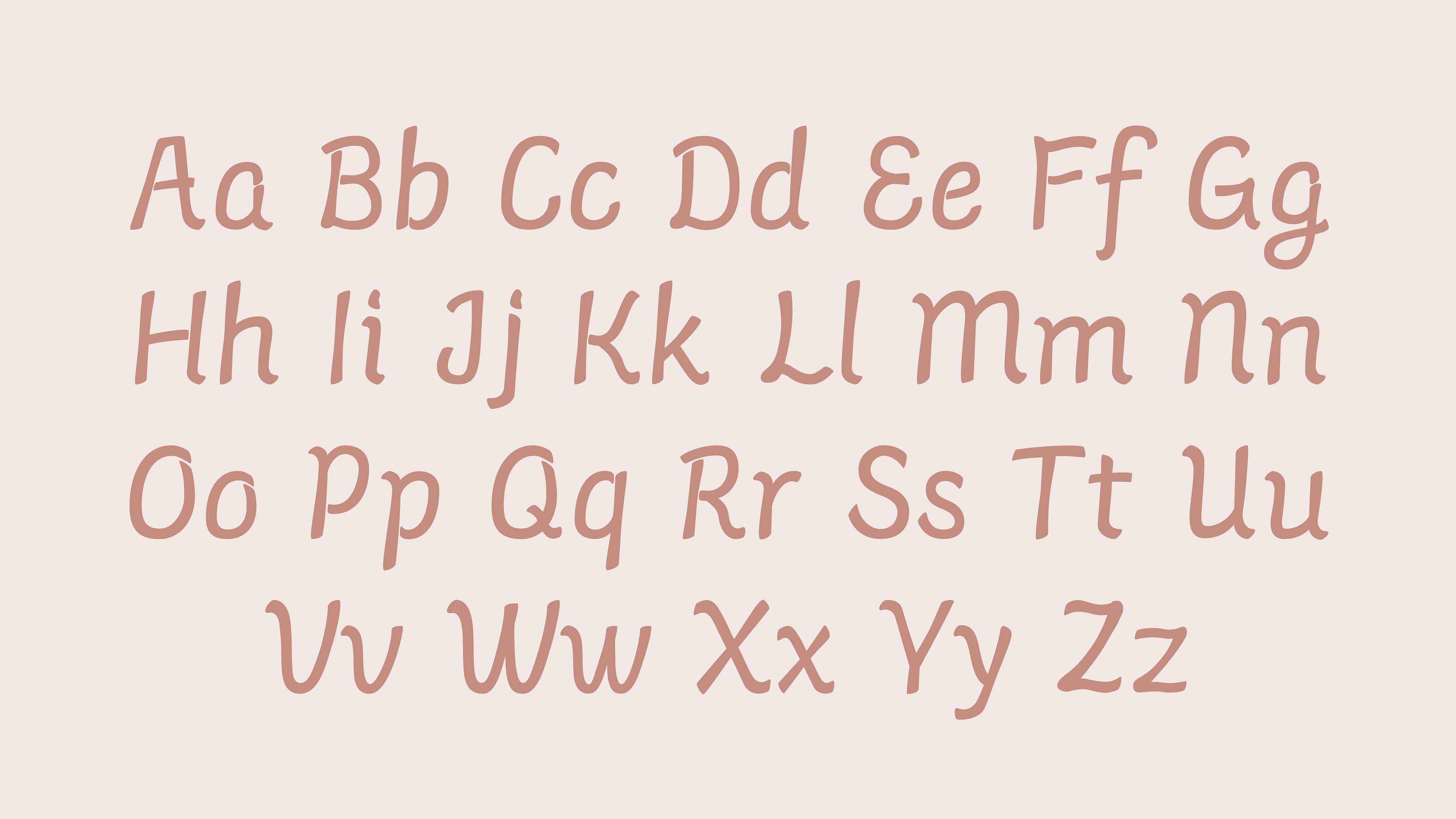
While Flourish is readable at small sizes, it still has a lot of personality. Each letterform has quick movements making it fun and energetic.
The weight of the shapes is distributed throughout the letters by the beveling of strokes. Letters double-back on themselves and gain weight by swelling rather than a typical open counter for a cursive loop.
Flourish remains delicate and soft with a little bit of sass. At larger sizes, you can easily see the shapes nicely interlock and move at a consistent speed. This typeface can be used in a more traditional setting or for a fun quirky children’s book. Being so versatile, Flourish’s characteristics allow designers to use unique font for any form of project.
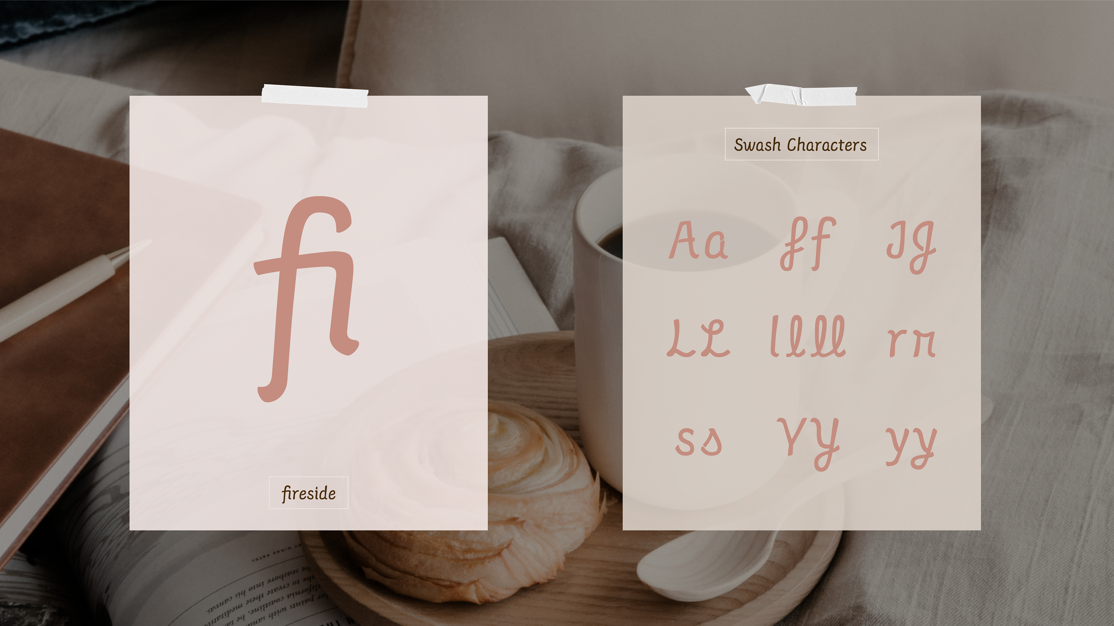
Ligatures and Swash Characters
Additional swash characters can be found in the Glyphs panel. These letters should be used at larger sizes to provide emphasis. This affords for the designer to choose if they prefer a simple case or unique swash.